Firstly, I wanted to show you just how different the same stamp can look with a different light source!
Here we have C.C. Designs Swiss Miss Rosalie with Roses. In the first picture, I have coloured her with the light source coming from the right:
And here I have used her with the light source coming from directly in front of her:
Skin: E000, E50, E53
Hair: E50, E31, E35, YG00, YG02 (YGs for the ribbon)
Dress: B00, B02, B05, R35
Socks: RV10, RV13
Shoes: C1, C3, C5
Roses: R32, R35
Now while some of the more seasoned Copic users might question my using E000 with the two E5* Copics, I was taught that when it comes to Copics, there are no rules! :) And my collection is still fairly limited (25 Copics to-date) so I had to make do with what I had, I'm not unhappy with the results. I have been blog-hopping, and have found that for skin tones, E000, E00, E02 are the most popular choices. I purchased the E00 and E02 today, and I am attending another Copic workshop this weekend, so stay tuned for *hopefully* some better Copic portraiture!
Next (sorry for the long post!), I wanted to show you how effective the "Cool" tones are! I was very reluctant to play with these, as I thought they were a bit of a boring group and wouldn't be very versatile. How wrong I was! I coloured in this gorgeous little Imaginisce Snag 'em Stamps Dolphin stamp: A perfect example of how you won't get the same result twice, even with the same light source!
Please excuse the ink smudge on the left Dolphin!
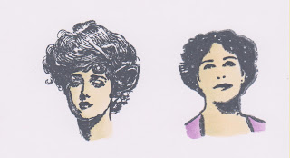
And FINALLY! I am a huge fan of anything vintage! And when I bought the VERY beautiful set of Hot Off The Press Vintage Ladies stamps, I was a bit concerned that they wouldn't be very versatile. This was BEFORE I started using Copics :) These look great either un-coloured, or coloured, depending on your co-ordinating papers! I haven't put one of these lovely ladies onto a card yet, but I will post pics as soon as I do! :)
Thanks for stopping by today! I hope to bring you more Copic goodness very soon! :)


No comments:
Post a Comment